Best Practices for Accessibility: Logos

 What comes to mind when you think about making your brand and business accessible for people with disabilities? Adding ramps to get in and out of your building? Braille lettering on the bathroom doors? While these are important accessible features, there are many ways your brand can be unwelcoming that you may not have even considered. For instance, did you know that your logo can be a source of accessibility concerns?
Your logo is vital for maintaining your brand’s identity. What if people with visual disabilities (5.7% of the Canadian population) or cognitive disabilities (5-9% of the Canadian population) have a hard time reading it? Up to 14% of Canadians might be unable to connect with your brand identity. This lack of connection most likely will discourage people from interacting further with your company. This situation is bad for your business and for the person who could have been a potential customer.
Don’t worry. We are here to help. You can follow some best practices when designing your logo that will ensure it is inclusive for all.
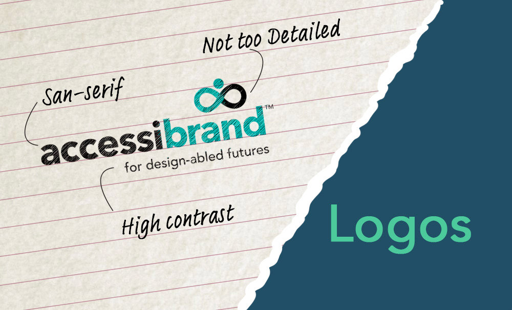
Use High Contrast Colour Palettes
No doubt, the colours in your logo must look good together, but more importantly, those colours must have enough contrast. Colours that are not far enough apart on the colour spectrum may blend together for people with visual disabilities, including people who live with colour blindness. Try to make sure that overlapping elements of your logo are distinct enough from one another to stand out.
Check the colour contrast of the overlapping elements of your logo (especially the text and its background). The colour contrast is the difference between colours measured by their lightness and darkness. Designers measure this difference with numbers. Industry minimum standards are a colour contrast ratio of 4.5:1 for normal-sized text and 3:1 for large text.
To check the contrast of colours in your logo, use this colour contrast accessibility tool. If your logo doesn’t meet the standards, it’s time to consider a palette change.
Ensure Fonts are Easy to Read
The type used in your logo is one of the most crucial parts of your design. The type tells first-time viewers to learn the name of your brand. As the saying goes, you only have one chance to make a first impression. If your text is difficult to read, some people with disabilities may have trouble identifying your brand.
Simple, serif or sans-serif fonts are the easiest and most accessible to read. Use fonts like Arial, Helvetica, Times New Roman, and other similar ones. Avoid using script style, cursive, or novelty typefaces when possible. If you feel you must use this kind of font, then have a more standard typeface version of the text alongside the stylistic font. Ensure that fonts are large enough to be read easily. Avoid placing text in unusual ways, such as upside-down or sideways.
Look at your logo from a distance, squint your eyes and try to make out the words. View it from various angles. If you do so and you can’t make out the words on your logo, it may be time to consider adjusting your typeface to something easier to read.
Keep it Simple
As a general rule, your logo should be easy to identify and not too visuallycomplex. A logo with too many details or a busy layout may be hard to identify or understand. Ask yourself if an average person could easily re-draw your logo. If it is hard to do, then your design may be too complex. Try fewer details and find a more simple design.
Use as few colour palettes as possible. Avoid gradients or too many similar shades of one colour to make sure the different elements of your design remain distinct. By doing so, you will enable people who have a hard time separating colours and words to see and read your logo.
Use Alt Tags
When using your logo on your website, be sure to include an alt tag. As we explained in a previous blog, alt tags are important for screen-reading programs to help those with visual disabilities navigate the web. Include a brief, descriptive alt tag to help website users identify your logo. Your description should help people understand your design even without the need to see your logo.
Conclusion
Designers often overlook the elements of logo design that relate to accessibility. Sadly, that means brands are missing out on potential customers. By keeping accessibility elements in mind, you can ensure that everyone finds your logo readable and understandable. All designers should be striving for an inclusive, welcoming brand identity.
| SHARE AND SUBSCRIBE |
|